





What’s the Point?
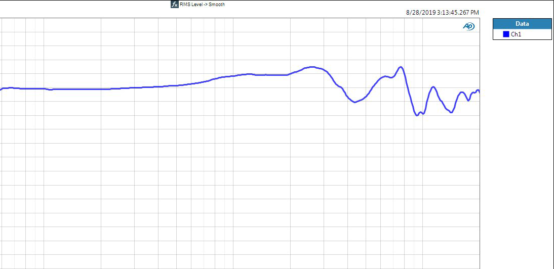
As a tool to help customers compare our various models and their flavors, we’ve created a series of “Average Frequency Response Graphs” and have begun to publish them on product pages. Since not everyone can easily visit their local dealer to listen, this visual representation is meant as an additional guide to reference one Audeze model against another – we have no intention of using these graphs to compare our headphones to another manufacturer’s products – and as always, the best way to know what any headphone will sound like is to listen to it (see this tech article for more detail).
To create the graphs, we measured a significant number of samples from the production line using our Audio Precision and B&K 5128 test rig and averaged them all into a single plot. Since every headphone pair measures slightly differently, these average graphs are not representative of any individual pair. We create and store individual graphs for LCD-X and above, so owners of those models can email support@audeze.com and request their graph based on serial number.
How Do I Work This?
Once the process is complete and all graphs are published, a curious customer could compare average graphs from a few different models and narrow down which ones they feel may resonate best for their taste and use-case. At that point, they can focus their energy on listening to those that appear to offer what they want and decide which is THE ONE for them.
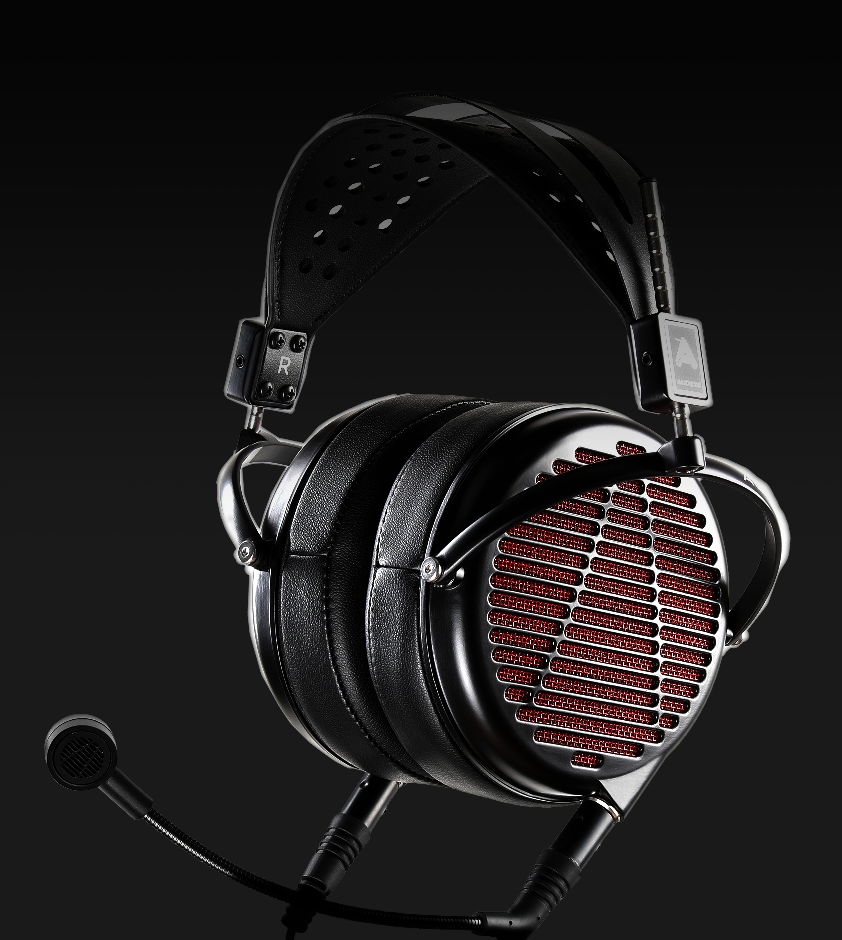
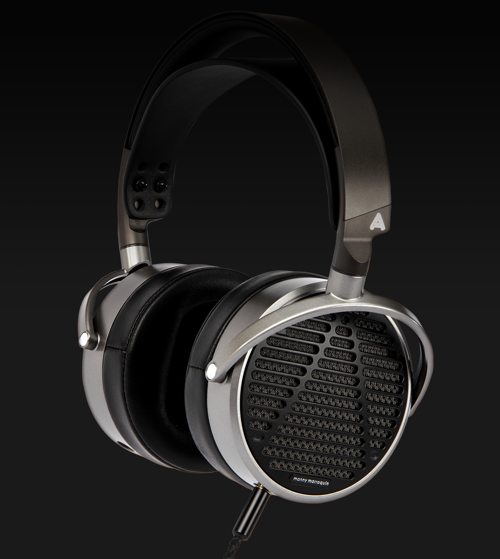
For example, a professional customer may compare average graphs for several models and narrow their listening selection to LCD-X, LCD-MX4 and MM-520, since they can see the differences between each model’s presentation of frequency balance: the relative levels of midrange/bass/treble response which inform the overall flavor of a headphone’s sound signature.
How Did I Get Here?
Our goal has always been to produce headphones that sound like excellent loudspeakers in a well-treated room. We consider each model to be a “different flavor of neutral” in the sense that they share some common themes (low distortion, fast transients, transparency) but differ in the way they present the balance of frequencies. Since everyone hears headphones very differently and has their own tastes and expectations (not to mention budgets), the “best” choice of model for one person may not be the same for another.
It may be useful to consider our headphone models as different kinds of chocolate, and each graph as a description of a chocolate variety: if you like chocolate you can be pretty certain you’ll enjoy most of the varieties on offer, but the best way to tell which is your favorite is to narrow down the selection by reading the descriptions, and then to taste them. Happy listening!